The lobby is one of the most important spaces in your office. It’s where visitors of every kind get their first, intimate glimpse at your company. If you’re not maximizing on this space, you’re losing out on a valuable opportunity! With new technology and emerging workplace design trends, it might be time to update your waiting area.
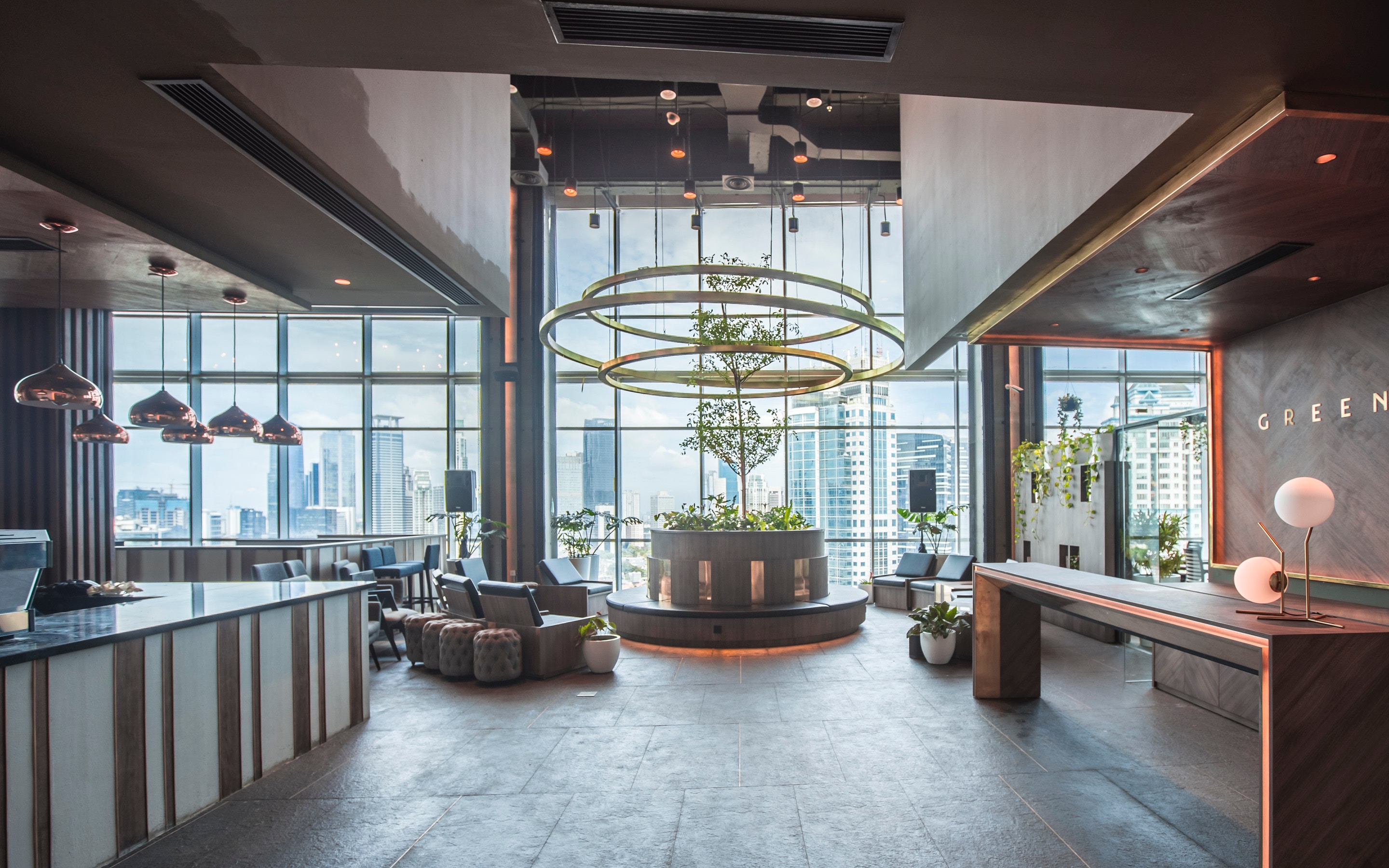
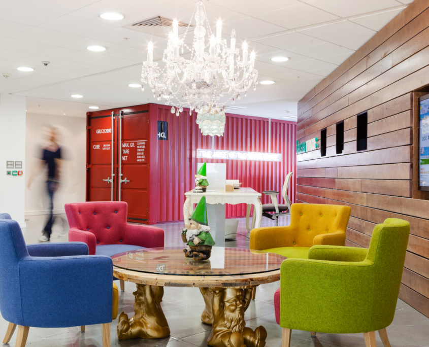
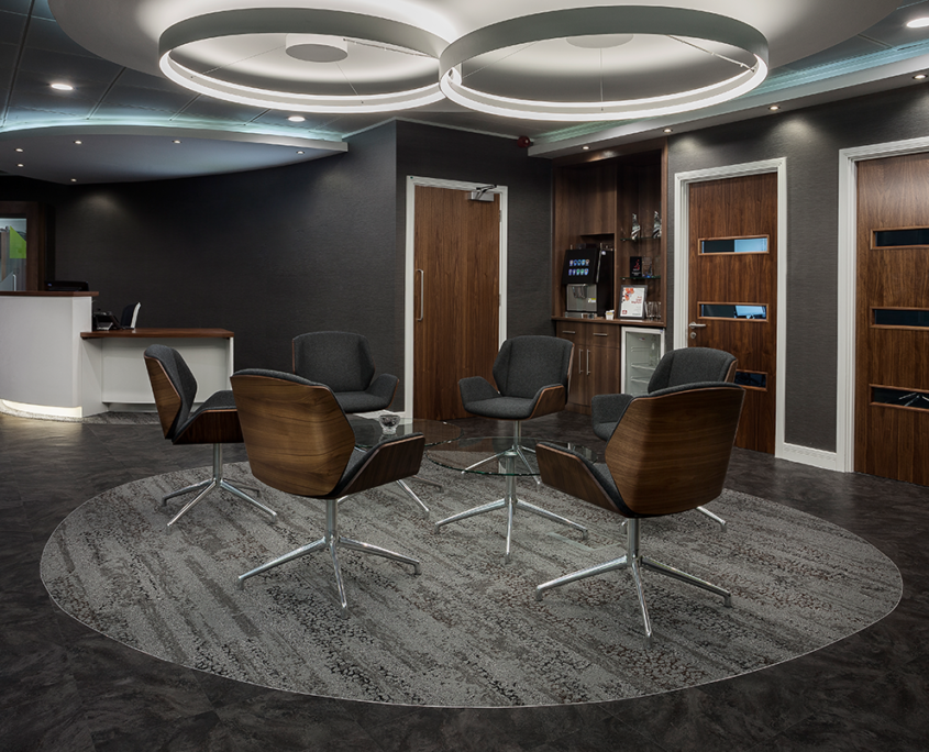
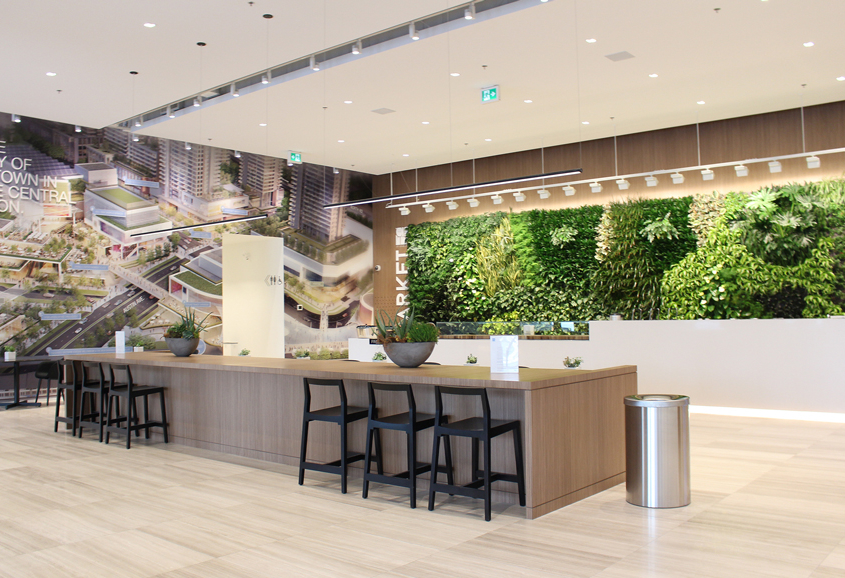
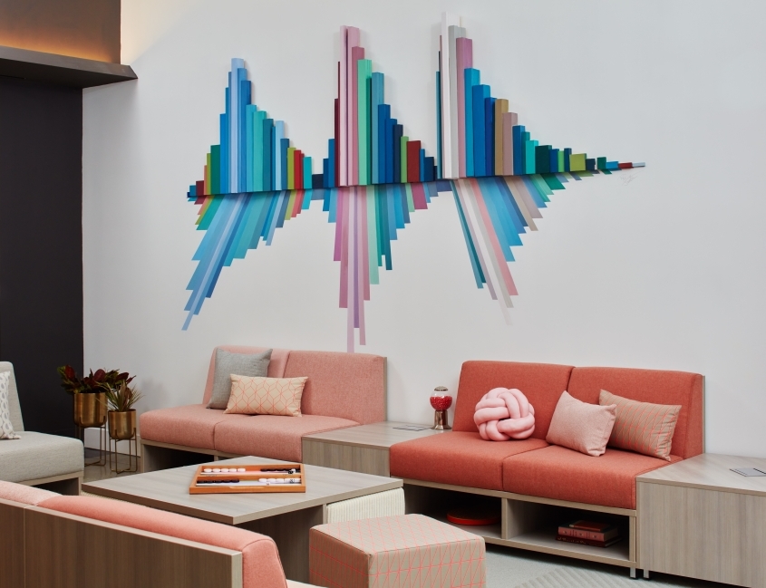
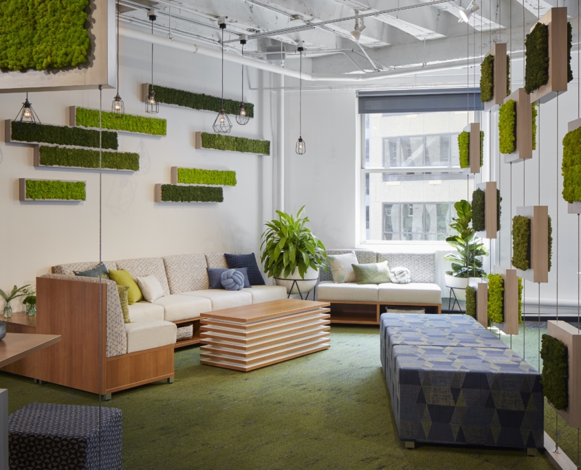
Above all things, a lobby should build memorable, emotional connections. This is your chance to showcase your brand with some great visuals. While some great wow-factors are structural, you can still make a great impact even if you don’t have vaulted ceilings and 17th century architecture. Use of color and wall wrappings are a great way to incorporate your brand into the space. Find a way to tell a visual story about your brand, and make the space speak that story.
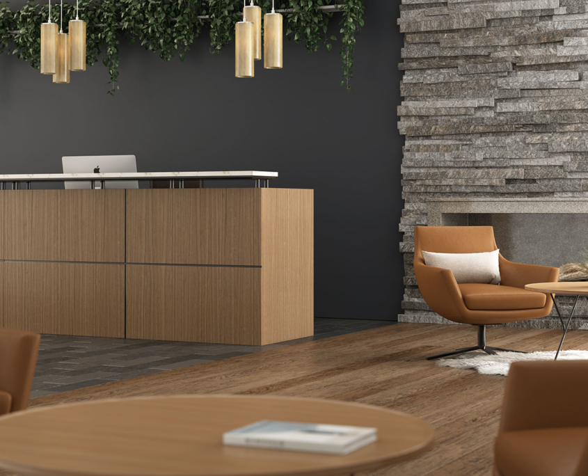
Waiting areas are also the workspace of your reception staff. You’ve invested in talent to make sure your guests have a great experience, so don’t let the rest of the space detract from their customer service skills. A well-designed lobby eliminates points of confusion for entrants. It can be unsettling to walk into a space and not know where to go. If you lack proper signage or accessibility features, the first impression you’ve given people is confusion. They won’t notice the custom-made coffee table and the carefully curated artwork when they’re just trying to figure out where to go and who to talk to.
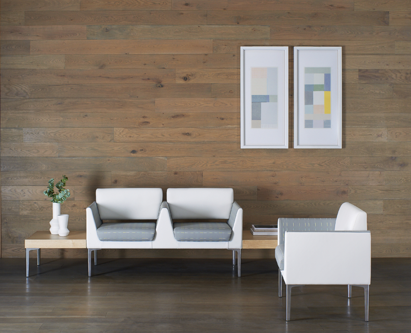
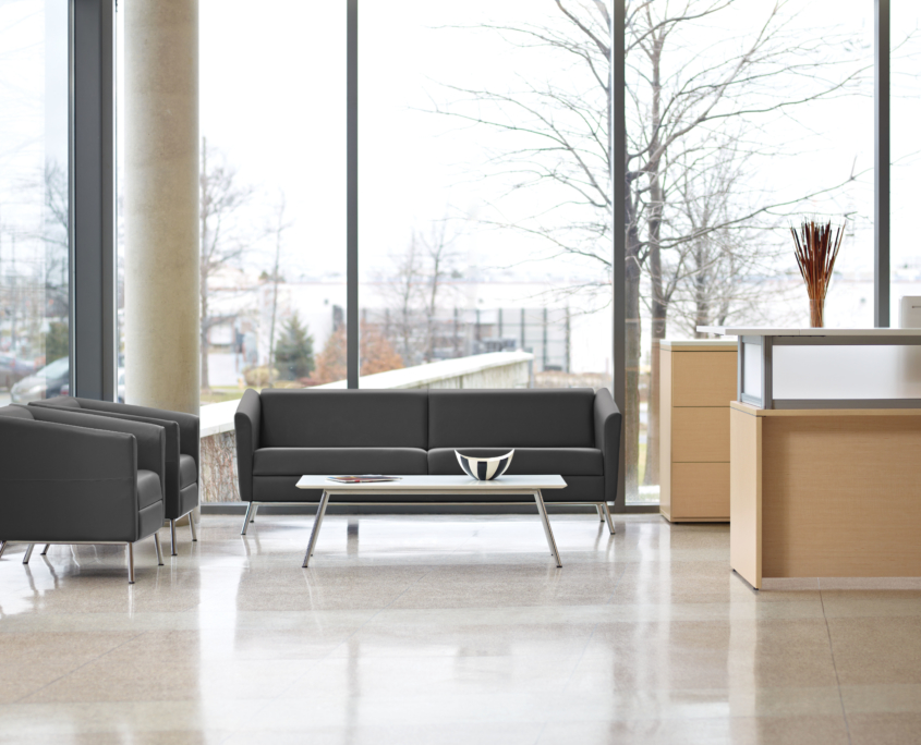
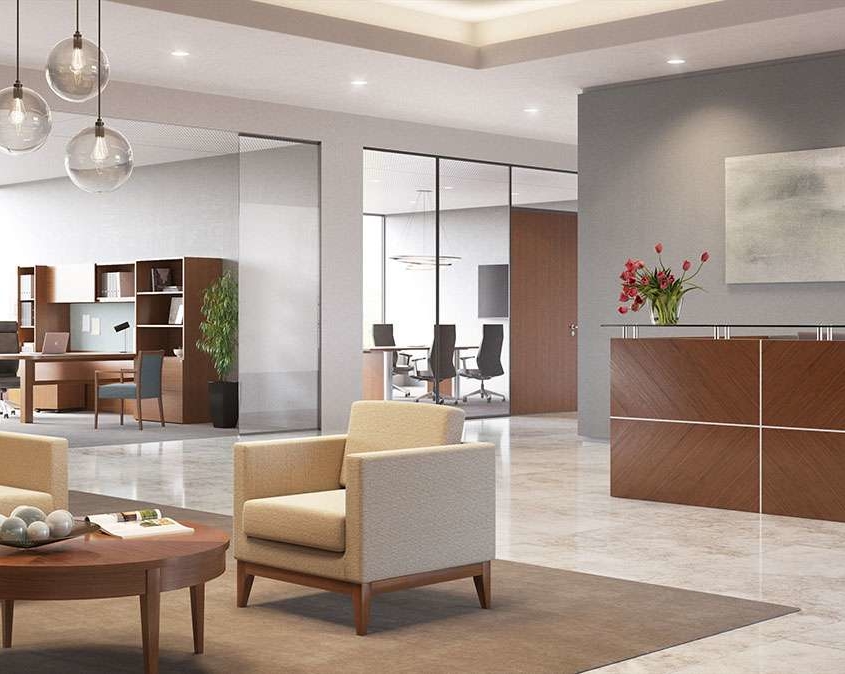
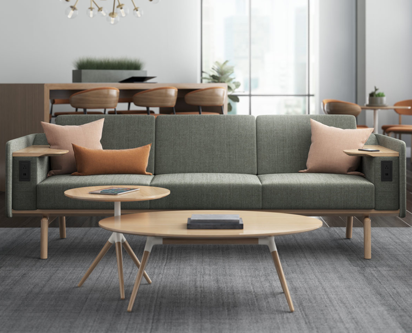
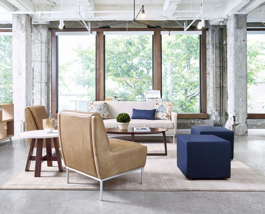
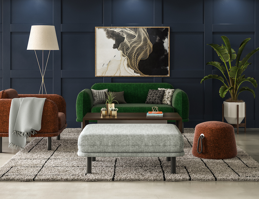
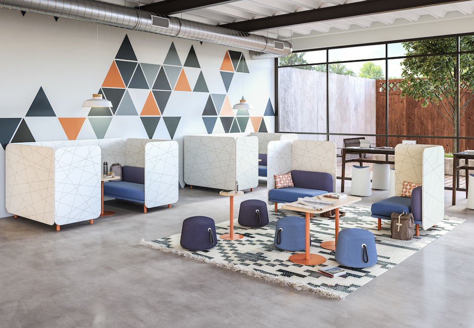
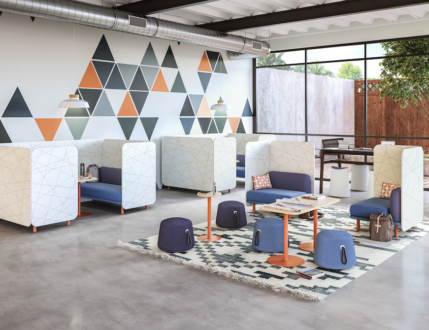
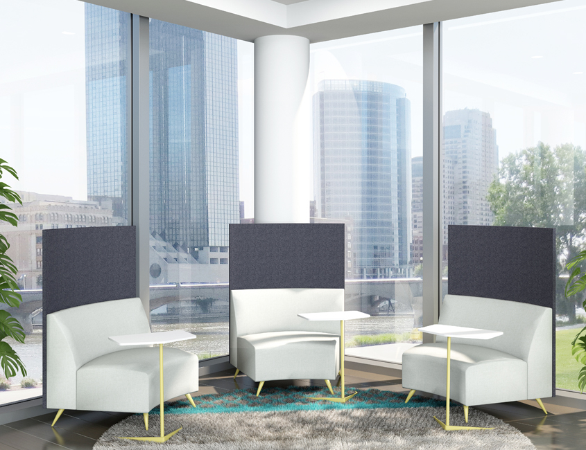
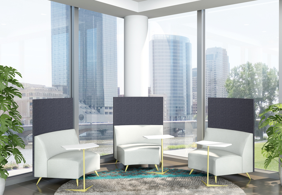
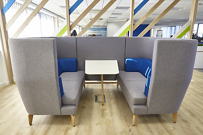
The foundation of a lobby is a comfortable place for visitors to wait. The resimercial – commercial with a residential feel – trend has taken over the office. There is no better place for this trend than the waiting area. Bench seating and disengaging design puts people on the spot. Instead, put them at ease with comfortable couches and armchairs.
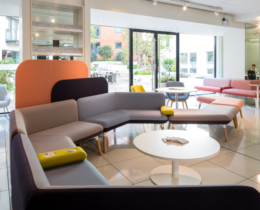
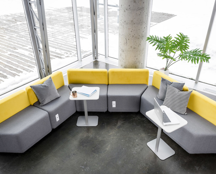
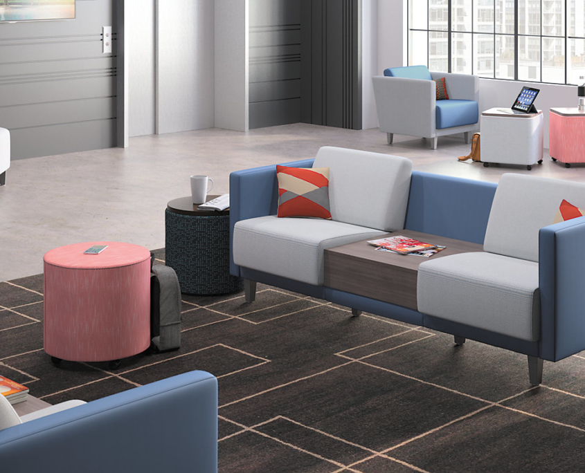
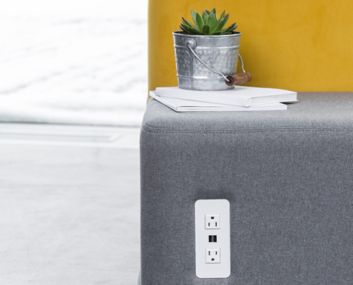 Many manufacturers are incorporating outlets into their furniture, giving people a convenient place to charge their devices.
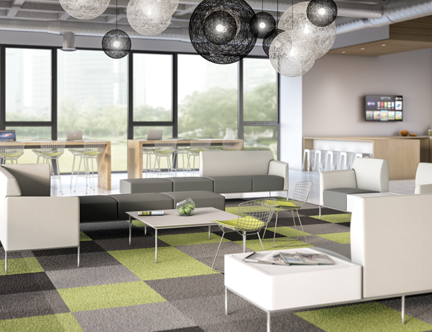
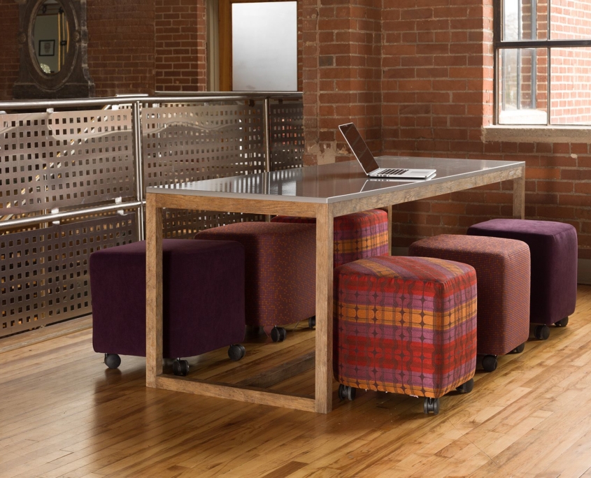
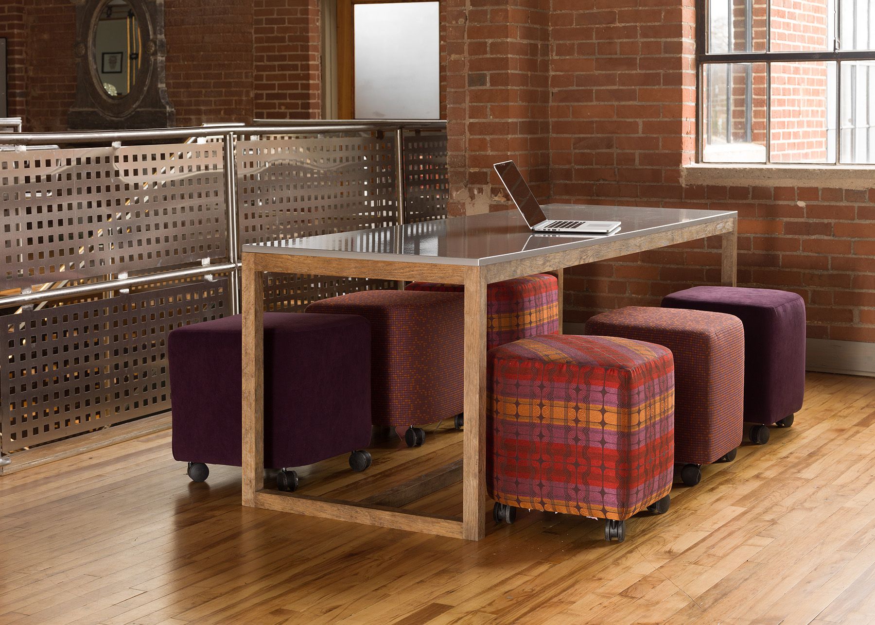
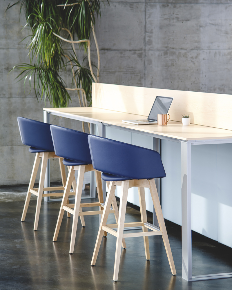
Depending on your business, it might even be a good idea to take a page from co-working spaces. Offer your clients a variety of seating and workspaces with small footprints. The college-grad coming in for an interview might appreciate a place to plug-in and review practice questions. The small marketing company would love a place for the team to review their proposal. The consultant would prefer to work in your conveniently-located lobby than their hotel lobby. You can lead the purpose of this space by giving people the tools to do more than just sit and wait.
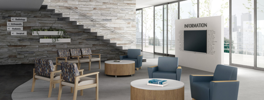 Many companies have invested in information kiosks that allow them to perform a range of tasks: Check-in for an appointment, announce their arrival to the person they’re meeting with, locate the appropriate floor or find restrooms.
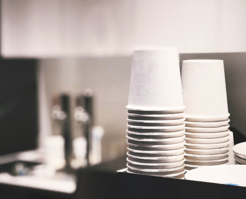
Lastly, don’t forget about the little things that can put your guests at ease. Offering beverages, a coat-check, non-slip mats at the entrance, and wet umbrella bags are just a few things to add. The point is to anticipate the struggles of your visitors and offer solutions that alleviate their problems.
So get out there! Leave your building, shake off your thoughts, and then enter as a guest. Take note of what you feel, where your attention goes, what’s missing, and make the investment to nurture the people who’ve invested their time in coming to your company.
As always, when you’re ready to make a change, give Rose City Office Furnishings a call at (503) 467-2767 and we’ll get started designing your new space!

